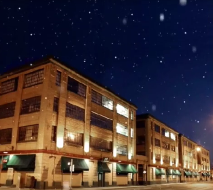
Indiana artists are hosting a Holiday Open House this Friday (December 4th). Free admission, free parking and free trolley rides to more galleries. Food music & art...
Yeah, I'm down!
Yeah, I'm down!

These are two posters (18"x24") I designed for the Holiday Open House at the Stutz Building.
If you're free on December 4th, you should add it to your Calendar.

"Monday is inevitable; style is a choice.
Welcome to Urban Mondays."
TWITER/INSTAGRAM:
@urbanmondays

This one's on the house, Indiana.
♥︎ Mike


This is a mockup of a sticker I designed for Dr. Squatch Soap Co. I can't take credit for the logo - that is the work of Mr. Todd Morin. But, I will take credit for picking out the type face that complements the logo, oh so well. The cursive text is on the transparent portion of the sticker, which helps give the illusion that it was written on the applied surface. Anyways, their soap is quite nice. I highly recommend checking it out.

Crossroads Realty Advisors has some brand new media to hand out. They have a steadfast approach to realty advising, so we crafted something that was simple, yet elegant to represent their brand. Our friends at Fineline Printing Group did a beautiful job of printing these business cards.

"Fersher" was the name of a company I tried to start back in 2012. The result of the company was, well far from groundbreaking. But, I did give me some good insight moving forward and as you can see here I had some fun with it anyways.

This is a email signature that I created to use as a personal branding element. It is designed to appear tattered and nostalgic, like something you might find on a package from the early 1900's.


*Click to see
matte finish.
By Mike Guggenheim, For
Crossroads Realty Advistors

If you look closely, you can see the slight "gradient overlay" across the logo. This feature adds dimension and creates the elusion of a glare.
I had a good time putting this one together for my 'ol pops and his long time friend Dr. Sando. None the less, I attend the party and had a grand old time dressing up like a greaser.
